LOOKBOOK
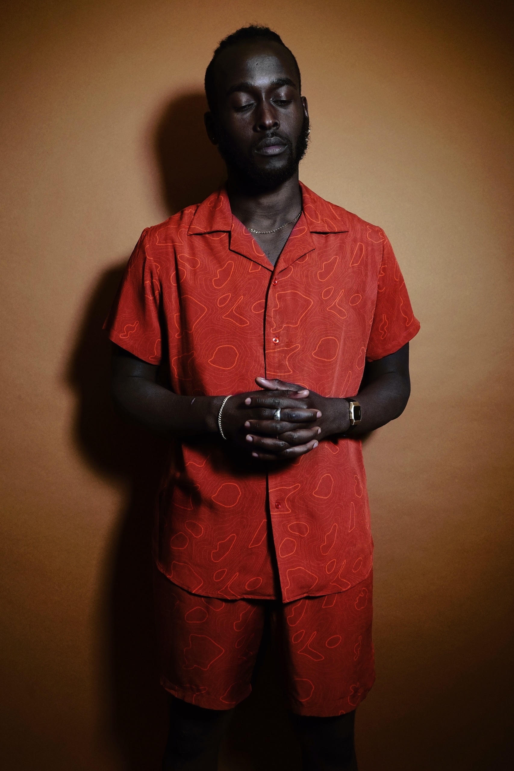
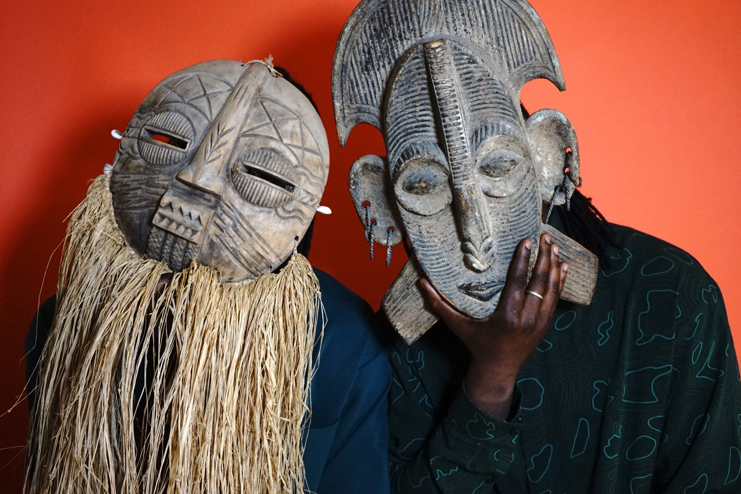
STORIES WE CHERISH MAP PRINT, COLLECTION 01, 2020
THE PRINT
This print represents what the brand stands for – our connection with the African continent and to each other.
Everyone who has had the opportunity to visit Africa leaves with a special memory that keeps them connected and wanting to return. These special memories are what we want to share with the world.
As Africans, we have been raised to open our hearts and doors to all. Stories We Cherish aims to open up and celebrate Africa’s quirky, creative and fun aspects that many people don’t get to see. Although borders and our history may separate us, we remain connected and united in spirit. Except when debating whose jollof rice is better!
How we conceptualised our print.
The idea of our Map print stemmed from an initial concept of branding lines, and this print was the cornerstone piece for our brand. Inspired by my experiences as an African in the diaspora, particularly my transition from Zimbabwe to the UK, I wanted to encapsulate the unity and diversity I found within the African community. Despite coming from different countries, we shared common struggles and supported each other in unique ways, fostering a sense of togetherness. The Map print not only symbolises this unity but also embodies the essence of our brand—love.
Our print’s flexibility allowed us to initially focus on the southern region of Africa, aiming to shed light on its often overlooked significance. By prompting viewers to question the represented countries and their significance, we aimed to foster a connection to the continent among a global audience, transcending cultural boundaries.
The collaborative process behind its design began with simple branding lines that gradually evolved into our best-selling print. Robert was the illustrator for this print, I have known Robert since I was 18, he is an amazing creative based in South Africa. I knew we had amazing synergy in design and trusted him to be able to decipher my creative thoughts. And he did this brilliantly.


